Colour combinations for every room
About 20 minutes to read. Published . By the House & Hedge team.
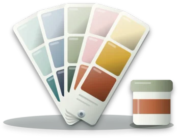
Choosing two colours for a room is easier than choosing one, because each colour tells you something about the other. A pair that works shows it at once: each colour looks more like itself beside the other. A pair that does not work makes one of them look dirty, or both of them look tired.
This guide gathers 24 pairs that work, grouped by how they sit on the colour wheel. For each one it says what the pair is, why it works, the rooms it suits, where each colour should go and what to watch for. Every pair opens in the colour combination tool, which shows any two colours together on the walls, a sofa or the woodwork of a drawn room. After the pairs, the second half of the guide explains the ideas behind them, so you can judge a pair that is not on the list.
The combinations
24 pairs, grouped by how the two colours sit on the colour wheel. The first colour named is the one to put on the walls, and the swatch shows the two roughly in the proportion a room would. Each pair opens in the colour combination tool, where you can see it on a sofa, the woodwork or a lower wall.
A colour with a neutral
The neutral calms the colour and gives the eye somewhere to rest, so the colour can be stronger than it could be on its own.
Sage and warm white
Light reflectance of sage 40 and warm white 81: 41 points apart.
A grey green with a soft, creamy white. Sage sits between green and grey, so it reads as a colour without ever being loud, and the white beside it has a little yellow in it rather than blue. Sage has a cool, grey cast. A warm white pulls against that just enough to keep the green from looking flat or chilly, and the two are about 41 points apart in lightness, so woodwork reads clearly against the wall.
- Best rooms
- Kitchens, where sage cupboards against white walls is a long-standing pairing, and bedrooms and bathrooms, where it stays calm in morning light and in lamplight.
- Where each colour goes
- Either way round works. Sage walls with warm white on the ceiling and woodwork is the quieter version. Warm white walls with sage cupboards or a sage sofa puts the colour where it is easier to change later.
- Watch for
- In a shaded room a grey sage can drift towards plain grey. Choose one with a little more yellow in it there, and test the sample on the darkest wall.
Duck egg and chalk white
Light reflectance of duck egg 60 and chalk white 86: 26 points apart.
A pale blue green with a clean, slightly cool white. Duck egg takes its name from the shell, and it sits on the line between blue and green. Both colours are light, so the pair reads as one airy field rather than as two colours. The white draws a crisp line at every edge and keeps the duck egg looking fresh rather than dusty.
- Best rooms
- Bathrooms and bedrooms, where its calm suits the room, and kitchens that get good daylight.
- Where each colour goes
- Duck egg on the walls with chalk white on the ceiling, skirting and doors. Wood, cane or brass in the room warms it a little.
- Watch for
- This is a cool pair, and in a shaded room it can look cold and grey. It is at its best in a sunny room. The two are only about 26 points apart, so do not rely on them to mark a step or the edge of a door.
Navy and warm white
Light reflectance of navy 3 and warm white 81: 78 points apart.
A deep blue with a soft white that leans warm. It is the most familiar dark and light pairing in decorating, the colours of a sailor's stripe. The gap in lightness is huge, close to 80 points, so every edge is sharp. A warm white rather than a brilliant one stops the contrast looking harsh, and its slight yellow sits well against the blue.
- Best rooms
- Living rooms and bedrooms that want depth, a hall where a navy lower wall hides scuffs, and a study.
- Where each colour goes
- Navy walls with warm white woodwork and ceiling for a rich room, or warm white walls with navy doors, a navy sofa or a navy lower wall for a lighter one.
- Watch for
- Navy walls swallow light. Paint them in a room with good daylight or plenty of lamps, and expect the colour to read close to black after dark.
Forest green and cream
Light reflectance of forest green 6 and cream 72: 66 points apart.
A deep, slightly blue green with a soft yellow white. Think of a library, or a panelled study. Cream carries a little yellow, a neighbour of green on the colour wheel, so the two belong together even though one is dark and the other light. The gap of about 66 points gives the room a strong frame.
- Best rooms
- Studies, living rooms used in the evening and dining rooms, where a dark wall makes lamplight glow.
- Where each colour goes
- Forest green on the walls, or on panelling and the lower wall, with cream above and on the ceiling. In a lighter room, cream walls with forest green doors and window frames.
- Watch for
- A dark green needs good light by day, or it reads as nearly black. Keep the cream soft, because a stark white against forest green looks cold.
Charcoal and blush
Light reflectance of charcoal 5 and blush 61: 56 points apart.
A dark, cool grey with a pale pink. The grey has no colour of its own, and the pink has just a little. The grey takes the pink's warmth and gives back depth. The pink keeps the charcoal from feeling severe, and the two are about 56 points apart in lightness, so both stay clear.
- Best rooms
- Bedrooms, where the pink softens the morning, and living rooms that want something less expected than grey and white.
- Where each colour goes
- Charcoal on one wall or all of them with blush on the ceiling, or blush walls with a charcoal sofa, headboard or bed linen. Repeat each colour at least twice so neither looks like an accident.
- Watch for
- Blush can look sugary in a large dose next to a cold grey. Choose a dusty pink with a little brown in it rather than a clear one.
Pale grey and mustard
Light reflectance of pale grey 65 and mustard 41: 24 points apart.
A soft, cool grey with a warm, earthy yellow: a quiet base with one bright colour on it. The grey sets no colour of its own, so the mustard carries the whole room. It is a strong yellow, so a little of it goes a long way, and the grey gives it space to breathe.
- Best rooms
- Living rooms, kitchens and children's rooms, where one bright accent lifts a quiet base.
- Where each colour goes
- Pale grey walls with mustard on a chair, cushions, a door or a run of open shelving. Mustard walls with grey is possible, but much louder.
- Watch for
- Mustard is easy to overdo. Keep it to about a tenth of the room at first and add more only if the room asks for it. The two are only about 24 points apart, so mustard stands out against pale grey by colour rather than by depth.
Chocolate and duck egg
Light reflectance of chocolate 6 and duck egg 60: 54 points apart.
A deep, warm brown like dark chocolate, with a pale blue green. Brown is a dark, muted orange at heart, and orange sits across the wheel from blue, so this is close to a pair of opposites in disguise. The warm dark and the cool pale balance each other, and the 54 point gap keeps them clear.
- Best rooms
- Bedrooms and living rooms, where the pair feels cosy and fresh at once.
- Where each colour goes
- Duck egg walls with chocolate in the furniture, a velvet chair or a dark wood floor. A chocolate wall with duck egg woodwork is bolder, and best in a room used at night.
- Watch for
- A lot of brown can feel heavy. Keep it low in the room, in the floor and the furniture, and give the pale colour the walls and the ceiling.
Burgundy and greige
Light reflectance of burgundy 5 and greige 46: 41 points apart.
A deep wine red with greige, the warm grey beige that sits between the two names. Greige has a little warmth, so it agrees with the red rather than fighting it, and it is quiet enough to let the burgundy lead. About 41 points of lightness keep the two apart without a stark edge.
- Best rooms
- Dining rooms, studies and living rooms used in the evening, where a deep red feels warm and enclosing.
- Where each colour goes
- Burgundy on the walls of a small room or on one end wall, with greige on the other walls and the woodwork. In a lighter scheme, greige walls with burgundy curtains, a rug or a chair.
- Watch for
- A deep red reads very dark by lamplight, and heavy in a room that is already small and dim. Try it first on a wall that gets good light.
Two neutrals
Neither carries much colour, so the pair works through lightness and texture, and almost anything can be added later.
Soft black and chalk white
Light reflectance of soft black 2 and chalk white 86: 84 points apart.
Black and white with the edge taken off both: a black with a little warmth, and a white with a little grey. This is the strongest contrast in lightness a room can have, more than 80 points, so every line and object reads clearly. Softening both colours keeps the contrast from buzzing.
- Best rooms
- Halls, bathrooms and kitchens, where a clean, graphic look suits the room, and doors, stair rails and window frames anywhere.
- Where each colour goes
- Chalk white walls with soft black on the doors, skirting, window frames or a stair rail. A soft black wall works too, in a small room with white woodwork and plenty of light.
- Watch for
- A whole room of black and white can feel cold. Bring in wood, plants or warm fabrics, and use the black where a strong line helps, such as a door frame or the edge of a step.
Taupe and cream
Light reflectance of taupe 26 and cream 72: 46 points apart.
Two warm neutrals: taupe, a grey brown, and cream, a soft yellow white. They sit almost together on the colour wheel and differ in lightness by about 45 points, so the room has depth without a colour in it. Texture does the rest: linen, wool, wood and stone.
- Best rooms
- Living rooms, bedrooms and halls, and anywhere you want a calm base that will take any accent later.
- Where each colour goes
- Taupe on the lower wall or the woodwork and cream above, or cream walls with taupe furniture and curtains. Add one stronger colour in small things if it starts to feel flat.
- Watch for
- With nothing to lift it, an all-neutral room can turn bland. Vary the textures, and keep both neutrals warm, because a cool grey beside them can look grubby.
Opposites on the colour wheel
They face each other across the colour wheel, so each makes the other look stronger. Let one lead and keep the other smaller.
Navy and mustard
Light reflectance of navy 3 and mustard 41: 38 points apart.
A deep, inky blue with an earthy yellow that leans towards gold. Blue and yellow orange sit opposite each other on the colour wheel, so each makes the other look more vivid. Navy is dark and mustard is mid, which adds about 38 points of contrast in lightness as well.
- Best rooms
- Living rooms, studies and children's rooms, where the pair feels confident and cheerful.
- Where each colour goes
- Navy walls with mustard in a chair, cushions or a lamp. Mustard walls with navy is the louder version, best in a small space such as a cloakroom.
- Watch for
- Opposites compete when they are used in equal amounts. Let one lead, roughly two parts to one, and keep the other as the accent.
Forest green and blush
Light reflectance of forest green 6 and blush 61: 55 points apart.
A deep green with a pale, dusty pink, the colours of a garden rose against its leaves. Green and pink are opposites on the colour wheel. Here one is very dark and the other very light, about 55 points apart, which takes the clash out of them and leaves the warmth.
- Best rooms
- Living rooms, bedrooms and dining rooms, where the green gives depth and the pink keeps it soft.
- Where each colour goes
- Forest green walls with blush on the ceiling, or blush walls with a green sofa, bed or painted furniture. Plants and wood sit naturally with both.
- Watch for
- Choose a muted, dusty pink. A clear sugar pink against a strong green can look like a sweet wrapper.
Teal and rust
Light reflectance of teal 12 and rust 12: the same lightness.
A deep blue green with a burnt orange, both rich and slightly muted. These are true opposites, at either end of the colour wheel, and the muting keeps them grown up. They have almost the same lightness, so the contrast comes from the colour alone.
- Best rooms
- Living rooms, dining rooms and studies, especially with wood and leather.
- Where each colour goes
- Teal walls with rust in velvet, leather, a rug or terracotta pots, or a teal sofa against a warm neutral wall with rust accents.
- Watch for
- Two strong opposites of the same lightness can seem to vibrate where they meet. Keep something between them, such as a wood frame or a white skirting, and never use them in equal amounts.
Dusty blue and terracotta
Light reflectance of dusty blue 35 and terracotta 20: 15 points apart.
A soft, greyed blue with the warm orange brown of baked clay pots. Blue and orange are opposites, and both colours here are softened, so the pair is warm and cool at once without a clash. It is the palette of a clay pot against a pale summer sky.
- Best rooms
- Kitchens, living rooms and dining rooms, and a sunroom or a porch.
- Where each colour goes
- Dusty blue walls or cupboards with terracotta floor tiles, pots or a rug, or warm white walls with both colours in the furnishings.
- Watch for
- The two are only about 15 points apart in lightness, so they do not separate strongly at a distance. Add a light neutral where an edge matters.
Lilac and sage
Light reflectance of lilac 47 and sage 40: 7 points apart.
A pale, greyed purple with a grey green, both soft enough to sit together quietly. Purple and yellow green sit opposite each other on the colour wheel. Both colours here are pale and greyed, so the pair is gentle rather than bold, like a lavender bed in the evening.
- Best rooms
- Bedrooms, children's rooms and bathrooms, rooms that are meant to feel soft and restful.
- Where each colour goes
- Lilac walls with sage furniture or bedding, or sage walls with lilac curtains and cushions.
- Watch for
- They are close in lightness, only about 7 points apart, so from across the room they merge into one soft tone. That is the point of the pair, but a door or a step in one of them will not stand out against the other.
Butter yellow and dusty blue
Light reflectance of butter yellow 72 and dusty blue 35: 37 points apart.
A soft, pale yellow with a muted, greyed blue, the colours of an old farmhouse kitchen. Yellow and blue sit far across the colour wheel from each other. Both are softened here, so the pair stays cheerful without shouting, and the yellow is about 37 points lighter, which keeps them clear.
- Best rooms
- Kitchens and breakfast rooms, children's rooms, and bedrooms that get the morning light.
- Where each colour goes
- Butter yellow walls with dusty blue cupboards, a dresser or bedding, or dusty blue walls with the yellow in the fabrics.
- Watch for
- Pale yellow changes a great deal with the light. In a sunny room it can look stronger than on the card, and in a shaded one it can turn greenish, so test it on the wall.
Set apart on the colour wheel
They sit about a third of the way round the wheel from each other: different enough to contrast, near enough not to fight.
Olive and dusty rose
Light reflectance of olive 16 and dusty rose 33: 17 points apart.
An earthy green that leans yellow, with a faded pink that leans brown. Green and pink sit far apart on the colour wheel, but the lean in each brings them closer, so they meet about a third of the way round rather than opposite. Both are muted, and the pair feels lived in.
- Best rooms
- Bedrooms, living rooms and dining rooms, where a softer, slightly faded look suits the room.
- Where each colour goes
- Olive on the walls or the lower wall with dusty rose in the fabrics, or dusty rose walls with olive furniture, velvet, or plants in olive pots.
- Watch for
- They are only about 17 points apart in lightness. A light neutral on the ceiling or the woodwork gives the room some lift.
Plum and ochre
Light reflectance of plum 5 and ochre 27: 22 points apart.
A deep purple that leans red, with ochre, a golden yellow earth colour. Purple and yellow are opposites, but this plum leans red and this ochre leans orange, so they sit about a third of the way round the wheel from each other instead. The result is rich rather than loud, with about 22 points of lightness between them.
- Best rooms
- Dining rooms, studies and living rooms used in the evening, where rich colour and lamplight belong together.
- Where each colour goes
- Plum walls with ochre in a velvet chair, curtains or brass and gold fittings, or a neutral room with both colours in the textiles.
- Watch for
- Both are strong colours. Use one on the walls and the other only in smaller things, and keep plenty of warm light, because plum reads nearly black in a dim room.
Neighbours on the colour wheel
They sit close together on the colour wheel, so they blend rather than clash and the room feels of a piece.
Sage and forest green
Light reflectance of sage 40 and forest green 6: 34 points apart.
A soft grey green with a deep forest green that leans towards blue. Both are greens, but sage leans towards yellow and grey and forest green towards blue, so they are neighbours on the wheel rather than one colour. The gap of about 34 points in lightness makes a quiet, layered room.
- Best rooms
- Kitchens, bathrooms and bedrooms, and any room that looks out onto a garden.
- Where each colour goes
- Sage walls with forest green cupboards, a lower wall or a door, or forest green on a kitchen island or a vanity unit in a sage room.
- Watch for
- A room of greens alone can feel heavy. Bring in a soft white on the ceiling and some wood or brass.
Teal and navy
Light reflectance of teal 12 and navy 3: 9 points apart.
A deep blue green with a deep blue, both dark enough to wrap a room. They sit side by side on the colour wheel and both are dark, so the pair is rich and enveloping. Only about 9 points of lightness separate them, so the room reads as one deep colour with two moods.
- Best rooms
- Bathrooms, bedrooms and studies, rooms where a dark, cocooning feel suits what the room is for.
- Where each colour goes
- Teal walls with navy woodwork, or navy walls with a teal sofa or teal tiles. Lift it with a soft white ceiling and some brass or wood.
- Watch for
- Two dark colours need good light. They will not mark an edge or a step on their own, so keep a light colour wherever a clear line matters.
Plum and blush
Light reflectance of plum 5 and blush 61: 56 points apart.
A deep purple that leans red, with a pale pink from the same side of the wheel. Pink and plum are neighbours on the colour wheel and far apart in depth, about 56 points. The pink lightens what the plum makes dark, and the room stays warm throughout.
- Best rooms
- Bedrooms and dining rooms, rooms used mostly in the evening, where the depth of the plum feels warm rather than dark.
- Where each colour goes
- Plum on the walls or on the wall behind a bed, with blush on the other walls and the ceiling, or blush walls with plum velvet and bedding.
- Watch for
- It is a very warm pair. In a sunny room it can feel heavy in summer, and it is happiest in a shaded room or one used in the evening.
Olive and terracotta
Light reflectance of olive 16 and terracotta 20: 4 points apart.
An earthy green that leans yellow, with the colour of baked clay. They sit near each other on the colour wheel, both earthy and both muted, so they blend into a warm, grounded room. They are almost the same lightness, only about 4 points apart.
- Best rooms
- Living rooms, kitchens and dining rooms, especially with wood, clay tiles and plenty of plants.
- Where each colour goes
- Olive cupboards or walls with terracotta tiles, pots or a rug, and a warm white on the ceiling.
- Watch for
- With so little difference in lightness the two run together from a distance. Give the eye an edge with a light neutral, and keep the pair to a well lit room.
One colour, two depths
They share a hue and differ in depth, which reads as calm and deliberate, and lets the deeper one shape the room.
Blush and terracotta
Light reflectance of blush 61 and terracotta 20: 41 points apart.
A pale pink and a deep clay orange from the same family of earth colours. Blush is close to a pale tint of terracotta, so the two share their warmth and differ in depth, by about 41 points. That makes this one of the easiest tonal pairs to live with.
- Best rooms
- Bedrooms, living rooms and bathrooms, where the warmth flatters wood, skin and lamplight alike.
- Where each colour goes
- Blush walls with terracotta in tiles, pots, a rug or a chair, or terracotta on a lower wall with blush above it.
- Watch for
- A whole room of warm pinks and oranges can feel close in summer. Add green from plants, or a cooler neutral, to give it some air.
Duck egg and teal
Light reflectance of duck egg 60 and teal 12: 48 points apart.
A pale blue green and a deep blue green, like the same water seen in the shallows and in the deep. Teal is close to a deep shade of duck egg, so the pair is one colour at two depths, about 48 points apart, and it reads calm and deliberate.
- Best rooms
- Bathrooms, kitchens and bedrooms, where the watery colours feel clean and calm.
- Where each colour goes
- Duck egg walls with teal tiles, cupboards, a vanity unit or a bath, or a teal lower wall with duck egg above it.
- Watch for
- It is a cool pair. In a shaded room, bring in warmth through wood, brass and lamps with a warm bulb.
Combinations by room
The same pairs sorted by the rooms they suit best. Most work in more than one room, so a pair can appear under several.
- Living room
- Navy and warm white, forest green and cream, charcoal and blush, pale grey and mustard, chocolate and duck egg, burgundy and greige, taupe and cream, navy and mustard, forest green and blush, teal and rust, dusty blue and terracotta, olive and dusty rose, plum and ochre, olive and terracotta and blush and terracotta
- Bedroom
- Sage and warm white, duck egg and chalk white, navy and warm white, charcoal and blush, chocolate and duck egg, taupe and cream, forest green and blush, lilac and sage, butter yellow and dusty blue, olive and dusty rose, sage and forest green, teal and navy, plum and blush, blush and terracotta and duck egg and teal
- Kitchen
- Sage and warm white, duck egg and chalk white, pale grey and mustard, soft black and chalk white, dusty blue and terracotta, butter yellow and dusty blue, sage and forest green, olive and terracotta and duck egg and teal
- Bathroom
- Sage and warm white, duck egg and chalk white, soft black and chalk white, lilac and sage, sage and forest green, teal and navy, blush and terracotta and duck egg and teal
- Dining room
- Forest green and cream, burgundy and greige, forest green and blush, teal and rust, dusty blue and terracotta, olive and dusty rose, plum and ochre, plum and blush and olive and terracotta
- Hall and stairs
- Navy and warm white, soft black and chalk white and taupe and cream
- Study
- Navy and warm white, forest green and cream, burgundy and greige, navy and mustard, teal and rust, plum and ochre and teal and navy
- Children's room
- Pale grey and mustard, navy and mustard, lilac and sage and butter yellow and dusty blue
How to read a colour combination
Three questions decide whether two colours belong together: where they sit on the colour wheel, how far apart they are in lightness, and whether each one leans warm or cool. The pairs above are grouped by the first question, and the write-ups answer the other two.
The colour wheel puts every hue round a circle, from red through orange, yellow, green and blue to purple and back to red. How far apart two colours sit on it decides how they behave together.
- Opposites sit across the wheel from each other: blue and orange, green and pink, purple and yellow. Each makes the other look stronger, which is why opposites feel lively. They are easiest when one leads and the other stays small, or when both are muted.
- Set apart colours sit about a third of the way round from each other. They contrast without fighting, and they suit a room that wants colour without tension.
- Neighbours sit close together, such as teal and navy, or olive and terracotta. They blend rather than clash, so the room feels of a piece.
- One colour, two depths is a tonal pair: the same hue, light and dark. It is the calmest way to use a strong colour, because nothing in the room disagrees with it.
- A colour with a neutral puts one colour beside a white, a grey, a beige or a brown. The neutral gives the eye a rest, so the colour can be stronger than it could be alone.
- Two neutrals carry almost no colour at all. The room works through lightness and texture instead, and it will take any colour added later.
Lightness matters as much as hue, and often more. Two colours close in lightness blend into one tone from across the room, even when their hues are far apart. Two colours far apart in lightness give every edge, door and piece of furniture a clear line. Neither is better: a small gap feels soft and calm, and a large one feels crisp and graphic.
Warm colours lean towards red and yellow, and cool colours lean towards blue. A neutral leans too: a white or a beige with yellow in it is warm, and a grey with blue in it is cool. Pairs feel most settled when the neutral leans the same way as the colour beside it, or when the warm and cool are set against each other on purpose.
Split the room 60, 30 and 10
Two colours in equal amounts compete, and the room never settles. A common rule of thumb is to give the main colour about 60 per cent of what you see, the second colour about 30 per cent, and leave 10 per cent for small accents.
In most rooms the walls are the 60 per cent, which is why the tool calls the first colour the main colour. The 30 per cent is the next biggest thing: a sofa and curtains, the kitchen cupboards, the woodwork, or the lower part of the wall below a rail. The 10 per cent is cushions, a lamp, a picture frame, pots and plants.
The floor and the ceiling count as well. A dark wood floor is a large area of brown, and a white ceiling is a large area of white, so take them into account before adding more of either.
Each colour looks more deliberate when it appears at least twice. A blush wall and a single blush cushion look like an accident; a blush wall with blush on a lampshade across the room looks planned.
Sunny rooms and shaded rooms
The same paint can look like two colours in two rooms of one house, and the direction the window faces is usually why. A room whose window faces the equator gets direct sun for much of the day: south-facing in the Northern Hemisphere, north-facing in the Southern. A room facing away from the equator gets light reflected from the sky, which is cooler and bluer.
That gives a simple rule for the main colour:
- In a shaded room, warm colours hold up. Terracotta, blush, cream, ochre and forest green with cream all stay warm, while cool greys and pale blues can turn grey and cold.
- In a sunny room, cool colours come into their own. Duck egg, dusty blue, sage and lilac are balanced by the warm light, and very warm colours can feel hot in summer.
- Rooms facing east and west change through the day. An east-facing room is bright and warm in the morning and cooler later, and a west-facing room is flat and cool in the morning and warm and golden in the evening, so test a colour at the time of day the room is used most.
Lamps change colour too. A warm white bulb, around 2700 kelvin, pulls every colour towards yellow, which flatters warm pairs and can dull cool ones. A cool white bulb does the reverse. If a room is mostly used after dark, choose its colours under its own lamps.
Light reflectance value, and why the gap matters
Paint makers measure lightness as a light reflectance value, or LRV, on a scale from 0 for black to 100 for a perfect white. Many paint charts print it beside each colour. A brilliant white is about 90, the warm white in this guide is 81, sage is 40 and navy is 3.
The LRV of the main colour tells you how a room will feel. Below about 15, the walls absorb most of the light and pull the room in, which suits a room used in the evening. Between about 15 and 55, the colour holds steady in most light. Above about 55, the walls bounce light around and make a small or dim room feel larger.
The gap between the two colours matters for more than looks. Guidance on designing for people with low vision, such as the British Standard BS 8300, commonly asks for a difference of at least 30 points between surfaces that must be told apart: a door and the wall round it, a step and the floor, a handrail and the wall behind it. A pair like teal and navy, only about 9 points apart, will not mark a step on its own, however different the two hues look.
Testing a pair before you paint
A screen is a good guide to whether two colours belong together and a poor guide to exactly how a paint will look. Before you buy enough for a room, test the pair on the walls themselves.
- Buy tester pots of both colours. A 30 ml pot covers about two coats on a patch 45 cm square, which is enough. See how much wall a tin of paint covers for the sizes.
- Paint each colour on a large sheet of white card, two coats, right to the edges, rather than straight onto the wall. Card can be moved, and the old wall colour will not show round it.
- Put the two cards side by side where the colours will meet: the main colour on the wall and the second against the skirting, the door or the sofa.
- Look at them in the morning, in the afternoon and under lamplight, and look at them beside the floor and the fabrics that are staying.
- Live with them for two or three days before deciding. A colour that is exciting on the first evening can be tiring by the third.
Once you have chosen, the paint calculator works out how many tins each wall needs.
How the colour combination tool works
The tool reads any two colours the same way this guide reads the 24 pairs: by their hues on the colour wheel, their lightness and their warmth.
Lightness is the light reflectance value. The tool takes the screen colour, converts each of its red, green and blue values from the screen’s curve back to straight light, and adds them in the proportions the eye responds to: 0.2126 of the red, 0.7152 of the green and 0.0722 of the blue. That gives the relative luminance used in screen contrast checks, and multiplied by 100 it is the LRV.
Hue is read from a colour space built so that equal steps look like equal changes to the eye, which keeps the angles honest for muted paint colours. Two colours within 30 degrees of each other on that wheel are one colour at two depths, up to 75 degrees apart they are neighbours, from 135 degrees they are opposites, and in between they are set apart. A colour with too little colour to have a reliable hue counts as a neutral.
For example, sage has an LRV of 40 and warm white 81, so the two are 41 points apart, clear of the 30 point line. Navy sits at 259 degrees on the wheel and mustard at 85, 174 degrees apart, so they are opposites.
The limits are the ones in the testing section. A screen colour is only close to a paint colour, every screen shows colour slightly differently, and a paint maker’s LRV is measured from the dried paint. Use the tool to narrow the choice, and the tester pots to make it.